top of page

Branding & Logo Design
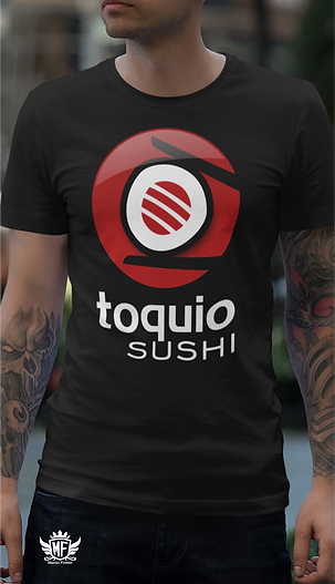
Toquio Sushi
The visual identity for Toquio Sushi was developed by Viking Arts, a studio specialized in branding and professional logo design. Led by Márcio Araújo, a branding specialist with over 20 years of experience, the project was created to position the restaurant within the Japanese fast food segment with a modern and memorable brand identity.
The symbol features a sushi held by two chopsticks, representing the essence of Japanese cuisine. The black, red, and white color palette, inspired by Japan’s national colors, reinforces authenticity, tradition, and strong visual presence.


bottom of page